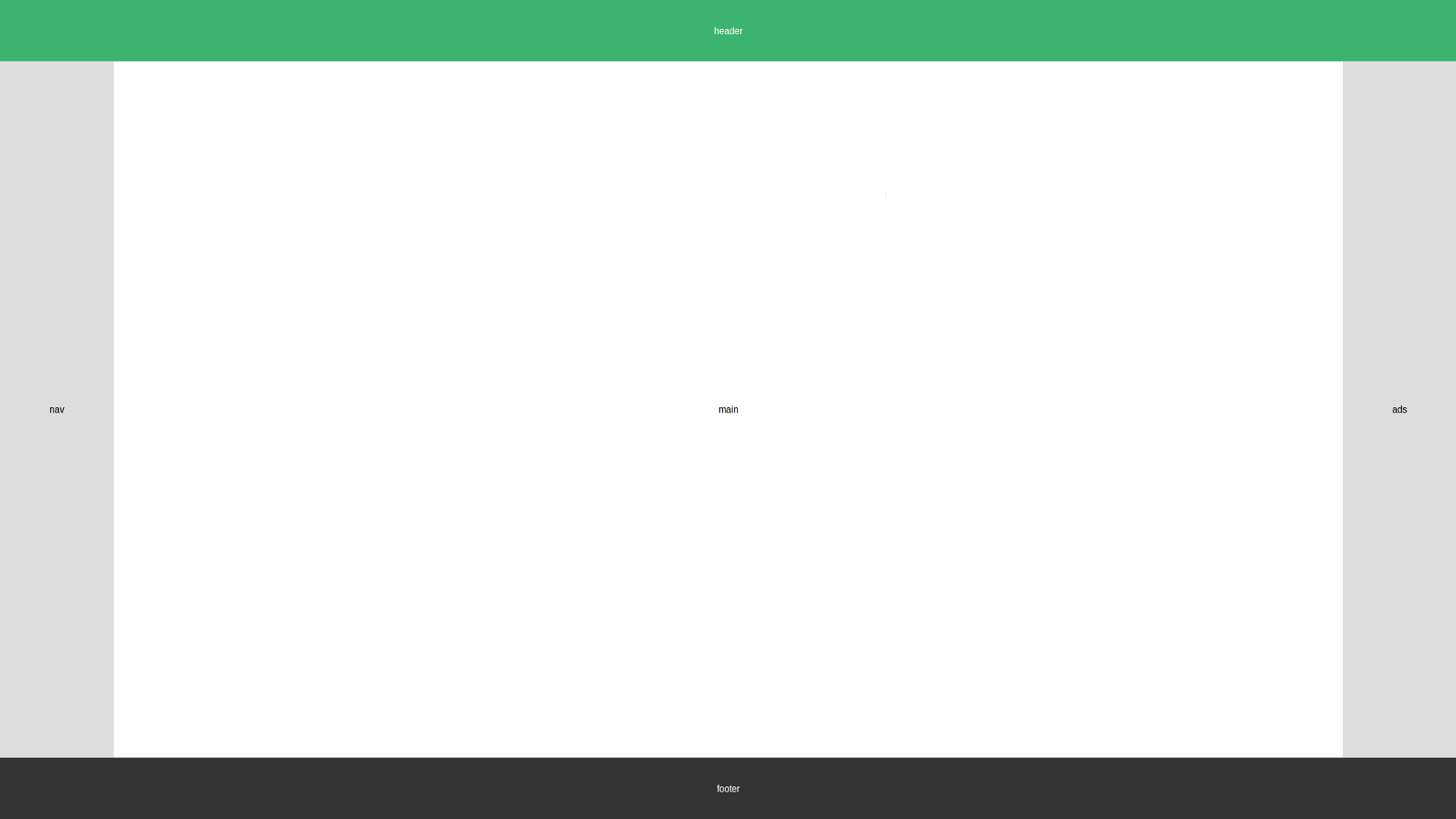
For those of you who never heard about a “Holy Grail Layout”: it refers to a web page layout that starts with a full-width header at the top of the page, followed by three columns containing the main content adjacent to two sidebars, all above a footer down at the bottom of the page (that stays there no matter the size of the main content).

Doesn’t look too complicated, does it? Well, from a designer’s perspective it certainly isn’t but just like the search for the “actual” Holy Grail, finding a proper implementation in code isn’t as trivial as it seems.
Developers used to work with tables and nested sub-tables to achieve the layout. While this may be viable solution, we all know: using tables for layout is EVIL and should be strictly avoided!
Using JavaScript is already a better way of doing it and generally works very well but it’s far from being optimal.
Enter Flexbox
All our misery changed for the better when the World Wide Web Consortium (W3C) introduced the “Flexible Box Module” or “Flexbox” for short. With it we can get to the Holy Grail Layout fairly easy.
| |
The HTML-Markup already looks promisingly clean. Now let’s work the magic in CSS:
| |
Let’s break this down
The entire body is a flexbox-container in column-direction, so from top to bottom. The header and footer are simple block-elements. Nav, main and aside are wrapped in a nested flexbox-container that aligns its children in row-direction. Nav and aside have a fixed width. The flex: 0 0 auto; is a shorthand property setting flex-grow and flex-shrink to 0 (so they will maintain their widths when the screen resizes) and flex-basis to ‘auto’ (so that the basis is taken from the width-property).
Setting flex: 1; in .hg-content basically means ‘Give me the remaining space!’. It causes the layout to stretch vertically because its parent (the body) has flex-direction: column; set.
The same property in main stretches it horizontally because its parent (.hg-content) has flex-direction: row;.
So those two lines are where the actual magic happens. If we took them out, we would see our layout collapse.
And that’s it already! Well… almost!
Mobile First!
If we were to approach the Holy Grail Layout with “Mobile First” in mind - as we always should these days because over mobile currently accounts for over 50% of all global web pages served - things change just a little bit:
Making a website mobile first means that the default layout is targeted at mobile devices. To realize that we only need to edit two blocks of CSS:
| |
It would look great on mobile devices but not so good on desktop browsers. Let’s add a media-query to compensate for that!
| |
What we did here was simply to tell CSS to apply our pre-mobile-first-values if the screen-width is 768px or above.
Try resizing your browser window to see the changes in effect.
Conclusion
That wasn’t too hard, was it? Flexbox removes a lot of the pain when composing a standard page-layout and helps us get to where we want much more easily with much cleaner code!
